Showing posts with label - P1. SECTION B - ADVERTISING. Show all posts

Tuesday, 24 February 2026

ADVERTISING: LESSON 1 - MEDIA LANGUAGE AND SET TEXTS

MEDIA LANGUAGE ELEMENTS

  • Layout
  • Typography
  • Use of Image
  • Use of Language
  • Use of Colour
  • Logo/Slogan/Brand Identity
MAINSTREAM (COMMERCIAL) ADVERTISERS USE MEDIA LANGUAGE TO
  • Establish brand identity
  • Make the the product more memorable
  • Promote positive associations with the brand
  • Differentiate the brand from its competitors
  • Engage with/validate the lifestyle choices of consumers
  • Engage with/validate the aspirations of consumers
  • Attract new consumers
  • Maintain existing consumers
NON COMMERCIAL (CHARITY) ADVERTSERS USE MED LANG TO
  • Raise awareness of issues (relevant to charity/service)
  • Build up brand image (promote positive associations in the minds of the public)
  • Reassure existing supporters of the charity
  • Persuade new supporters to donate
SET TEXTS:

DOVE: "Too Many Cooks" Beautifully Real Moms Campaign - 2018


RIVER ISLAND: "Labels are for Clothes" campaign 2018

Sunday, 22 February 2026

ADVERISING LESSON 2: AIDA MODEL

 SOURCE: AIDA Model EXPLAINED with EXAMPLES | B2U | Business-to-you.com


Attention
The first level of response is the cognitive stage of customers. This is the act of thinking about the product. At this stage, customers are becoming aware of the product and start to develop some knowledge of the product’s attributes and benefits. The Attention stage is usually triggered through advertising. All products or brands that customers are aware of, are part of the so called ‘awareness set‘. This is a smaller portion of the ‘total set‘ of products and brand that are available within a certain product category.

Interest
After the cognitive stage, customers enter the affective stage. At this level customers have gone beyond mere knowledge of the product and have actually begun to develop attitudes, preferences and perhaps even interest in the product. All products or brands that customers have interest in, are likely to become part of the so called ‘consideration set‘. This means that customers are seriously considering purchasing the product eventually. However before taking action, customers will need to go through two more stages.

Desire
The Desire step of the AIDA Model is still part of the cognitive stage of customers. However, the interest customers initially had, has developed even more into an actual need. Customers are already imagining themselves with the product.

Action
The final stage is the behavioural stage. This is where the customers take action. This could vary from visiting a retailer to see a product demonstration or writing an email to a shop owner for more information on the product. Of course, ultimately these actions should hopefully lead to the purchase of the product. Consequently, products or brands that made it to this stage are part of the ‘choice set‘ or ‘purchase set‘.


Saturday, 21 February 2026

ADVERTISING LESSON 3: COMPARING CHARITY ADVERTS

Compare the way that Source A and B use Media Language to construct values, attitudes and beliefs.

In your answer you must:

  • consider how Media Language is used to construct media messages related to values, attitudes and beliefs
  • make judgments and reach conclusions about how audiences might respond to these media messages

REMEMBER

NON COMMERCIAL (CHARITY) ADVERTSERS USE MED LANG TO

  • Raise awareness of issues (relevant to charity/service)
  • Build up brand image (promote positive associations in the minds of the public)
  • Reassure existing supporters of the charity
  • Persuade new supporters to donate
SOURCE A: SHELTER ADVERT


BUT WHERE WILL BE LIVE?
Losing your job doesn't have to mean losing your home. We can help.
Every year we help thousands of people avoid losing their homes.
Search 'Shelter House Advice' now.

HE CAN'T DO THAT
As a tenant it's hard to know where you stand. We can help.
Every year we help thousands of people with difficult or rogue landlords.
Search 'Shelter House Advice' now.
To donate text Home40 £5 to 70070.

I CAN'T FACE IT
Debt can seem too big to face, but if ignored can threaten your home. We can help.
Every year we help thousands of people avoid losing their homes because of debt or other problems.
Search 'Shelter House Advice' now.
To donate text Home40 £5 to 70070.

SOURCE B: THE LIFETRUST.ORG ADVERT


Sunday, 9 March 2025

SAMPLE QUESTION: Print Media

SOURCE C - Part of Baby Dove's 2018 Real Mom's campaign.

SOURCE D - Part of Nivea Baby cream advert 2014. The text reads: NIVEA BABY, Mildly cleanses and moisteurizes your baby's skin while protecting it from drying out - softness for 24h. / Developed with doctors, nurses, midwives and experienced mothers: mildest protection from NIVEA.


Analyse how effective the representations in Source C and Source D are in making claims about realism. 

In your answer you must: 

    • analyse the representations in Source C and Source D in relation to claims about realism 

    • make judgements and draw conclusions on the effectiveness of these representations.  [15]

Monday, 4 December 2023

ADVERTISING: LESSON 6

USING THE A.I.D.A. MODEL, DISCUSS HOW THESE TWO ADVERTS USE REPRESENTATION TO MARKET THEIR PRODUCT TO THEIR TARGET AUDIENCE.

In your answer you must:
  • Analyse how representation is being used differently in each source.
  • Make judgements and reach conclusions about the effiacy of each advert in reaching it's target audience.

(15 marks = 25mins)

[You can use these resources for a greater insight into the campaign: Beautifully Real Moms (wpp.com)


Wednesday, 8 November 2023

ADVERTISING: LESSON 4 (Question)

EXPLAIN HOW STEREOTYPES ABOUT BEAUTY AND FASHION ARE BEING USED AND CHALLENGED IN THE RIVER ISLAND ADVERT.

In your answer you must:
▪ Analyse how stereotypes are being used and challenged in the source. 
▪ make judgements and reach a conclusion about the advantages of challenging these stereotypes for the River Island brand. 

 (15 marks =25 mins)

[You can use this resources for greater insight into the campaign: SS Campaign - River Island]


Wednesday, 18 October 2023

ADVERTISING LESSON 3: SET TEXTS

The following three advertisements are the set texts. 

Look at each one carefully and consider: 

How can the AIDA model be applied to each of them 
How they conform to the list of ways in which Media Language is used in advertising 

RIVER ISLAND ADVERT 

DOVE ADVERT

SHELTER ADVERT


Wednesday, 14 December 2022

Viewpoints and Ideologies - The body of the essay

My introduction:

The two most prominent ideological positions in The Old Spice advert are a deconstruction of patriarchy (arguably a feminist viewpoint) and a critique of consumerism. The advantage to the brand is that this ironic twist on fragrance advertising for men allows them to establish a very memorable and arguably unique brand identity, differentiate themselves from their competitors and to validate the aspirations of consumers all while poking light-hearted fun at them. It also allows them to target a mature male audience (existing customers) while also engaging a new audience (women buying for their partners). 

A good introduction should answer the question and make it clear what you are going to be writing about. It should NOT contain anything that is unnecessary. 

What will I be writing about?


Now that we have written our introduction, the next step is to write the essay. There may be several ways to approach this, but here are two good options.

Option 1: Technique Approach 

  • Paragraph 1 - Write about image (250 - 300 words)
  • Paragragh 2 - Write about language and typography (150 - 200)
  • Paragraph 3 - Write about the pack shot or branding.  (100 words)

Option 2: Ideology Approach

  • Paragraph 1 - Write about patriarchy/feminism. (300 words) 
  • Paragraph 2 - Write about consumerism. (300 words)

Task 2: We are going to have a go at approach number 2 and write a paragraph on consumerism.


This paragraph should include: 

  • Specific and detailed examples from the text.
  • Analysis of the way that example is used to construct/deconstruct consumerism.
  • Evaluation of the effectiveness of this approach regarding the target audience (advertising values). 
This should take you 10 minutes in the real exam, so limit yourself to 300 words and then post your answer in the comments section below.

VVVVV
VVV
V


Tuesday, 7 June 2022

UNSEEN PRACTICE

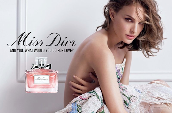
Look carefully at the advert for Miss Dior perfume, which features Hollywood actress, Natalie Portman.

How are the advertisers using Media Language to constructs gender stereotypes?

In your response you should consider:

  • The way that gender stereotypes are being constructed. 
  • The way that this is used to communicate ideas to the target audience


EXAMPLE 1:
This example attempts to structure its response around Mulvey's 'Male Gaze' hypothesis.

One of the ways that we can analyse the construction of gender stereotypes in this advertisement is to consider Mulvey’s ‘Male Gaze’ hypothesis. Portman is depicted in a suggestive and sexualised way, effectively constructing the female stereotype of sexual object. Her hair and makeup and the soft lighting encode a representation of female flawlessness, which is a generic convention in the beauty industry; even her ‘bed hair’ is perfectly imperfect allowing the audience to see her perfect jawline, her perfect eyes and her perfect skin. Her pose and the absence of costume also connote the idea of flawlessness, delicacy and femininity as well as contributing to the sexualisation of her image. If the intended audience is female, then this may suggest a preferred reading of validating the aspirations of the audience who perhaps want to have the same sexual allure. This may be reinforced using eye line matching, which positions the audience to see themselves as the equal of the aspirational Hollywood actress. However, it seems likely that the target audience is men, purchasing for wives, girlfriends etc. The sexualisation then would likely be intended to make the product more memorable and perhaps to promote positive associations with the brand.

The brand itself is represented as deeply feminine. The stylised serif font, and the choice of the word ‘Miss’ connote femininity and youth, both of which are generic conventions of the representation of women in beauty advertising. The pack shot is transparent so that purchasers and consumer (who may not be the same gender) can tell that the product itself is pink. In western culture, pink is a colour that has a cultural code of femininity. In addition, the pack-shot also features a bow. This, like the brands font may be intended to connote youthful playfulness but may also connote the idea of the product as a gift aimed at male purchasers and female consumers.

While there are no physical representations of men in the advert it seems likely that the line of text (arguably the product slogan) is aimed at them as a target audience. It asks the rhetorical question, “And you, what would you do for love?” Again, we can apply Mulvey’s hypothesis here as it subjectifies men, using the pronoun “you” to directly address them, but also the verb “do” which connotes action, an essential element of being a subject. The male audience is called to action with the rhetorical question, which is directly above the pack shot. The target audience seems to be positioned to respond to the question by purchasing the product that is directly underneath it. The typography, colour and language is also significant in terms of the stereotyping of the male audience. The bold and capitalised font has connotations of strength and directness, both stereotypical traits of masculinity, and the monosyllabic language connotes simplicity and directness in the intended male target audience. 


STUDENT EXAMPLES

Example 1:

Throughout this advert media language is used to construct and invoke stereotype build around both femininity and masculinity, one of the main examples of this found in the advert is contained in its typography, where a tall, elegant, cursive typeface is used to connote ideas of fragility, grace and beauty, serving to activate the stereotypical myth of femininity and what a woman should be. This stereotypical depiction of woman continues throughout the advert with the pack shot displaying a pale pink bottle with a bow on it, with these elements again connoting these traditional feminine stereotypes with pink being a colour commonly used throughout media to portray womanhood. The bow on the pack shot my also connote that this product is indented as a gift for a woman brought by a man with this being further enforced through the tagline which says, “what would you do”, placing the audience in an active, and therefore stereotypically masculine role. This tag line also suggests masculinity through the use of a bold, capitalised, sans-serif typeface which connotes sturdiness and confidence, juxtaposing the other typography found throughout the advertisement and invoking the myth of traditional masculinity and manhood. The adverts main image depicting Natalie Portman also reinforces traditional feminine stereotypes portraying her in a passive role, and presenting her as a sexual object, as shown by her lack of costume, presenting as alluring for the male gaze of the advertisements target audience and suggesting that if they buy this for their partner it may bring them closer to this ideal of traditional feminine beauty, which is a stereotype of beauty products, with the model here being portrayed with perfect hair and skin, despite the advert attempting to display it as natural further enforcing the stereotype of feminine perfection. 

12/15 

This is a little too short to cover a sufficient range of example needed for full marks, but the quality of your analysis and expression is absolutely spot on. I would not change anything that you wrote, just write a little more. If you can include around 100 more words (450 in 25 minutes seems a reasonable ask) you will do exceptionally well. 

I enjoyed reading this.


Example 2:

Brand identity is immediately established with the logo (which is the name of the brand) written in big elegant black font, right in one of the “rule of Z” sweet spots meaning it is one of the first things to meet the eye. The font confirms the product to be feminine as a stereotype for women is that they like elegant and pretty products. Underneath this is a pack shot of the product, a perfume bottle. The bottle is a pastel pink which in the west, signifies femininity and youth; along with the bow at the top of the bottle signifying a perfect gift to get a girl. It’s suggested that this advert is aimed at men buying a gift, supported by the plain bold font saying “and you, what would you do for love” implying that buying this perfume is a daring and almost heroic action for love which adds to the romantic appeal of the bottle. Especially as Miss Dior is very expensive, this seems to be aimed for men who either are desperate to impress a new gf or love interest, or a man with a good relationship with his s/o. 

The woman in the poster is used to catch the eyes of a buyer, as she is in the middle of the page and nearly naked which appeals to the male gaze. The model is famous actress Natalie Portman which will make the brand memorable as she is an easy and popular face to remember. Being naked while covering herself with bed sheets suggests a sexual tone of this perfume which is very appealing to the male gaze, as well as the flawless makeup and hair with a sexy expression.  Along with the bold phrase next to her back, it can imply that by getting this perfume, your s/o will want to have sex with you and look as flawless as Natalie does in the poster. There is a slight contrast with the innocent looking bottle with bows and pastel pink and the naked woman in bed, however this would also appeal to the male gaze as innocence is often sexualised in media and in other industries.  

Excluding the brand identity, it doesn’t differentiate itself from its competitors as many posters for many perfume brands follow a very similar format. A conventionally attractive woman giving sex eyes straight into the camera (so it gives the illusion of following you), a bottle either in lustful colours such as dark reds or innocent colours like pastel pink, and a catchy phrase to draw in the purchasers. This advert could appeal for women buying perfume for themselves as they may look at how pretty the model is, and with unrealistic body type representation in top brands, may believe that they will feel sexy and appear sexy to their s/o.  

12/15 

You did a really good job here. There is a good range of examples and you have linked with some of the bullet points around advertising. I would like to see even more explicit reference to the question (it's very easy to lose sight of that) and also, more use of terminology. Encoding, Decoding, Positioning etc. 

It's good, but those little touches will lift it to A star.


Example 3:

The use of typography to establish the brand name in ‘Miss Dior’ immediately establishes femininity through using a cursive, soft, italicized font, placed at the beginning of the Z-rule to immediately associate the advertisement with the brand identity. Continually, the advert further establishes brand identity through use of a pack shot directly underneath the text, drawing attention with its contrasting use of pink amongst the white background. In addition, the use of pink further continues the association of the brand with femininity, possibly alluding to a female audience, particularly with the general mise en scene of the left side of the advertisement. The bottle itself further conveys the sense of femininity through the pale shade of pink, a traditional stereotype for female products, as well as the bow which could introduce an alternative reading of youth or establish a male audience by implying the product as a gift to females. Between the brand logo and pact shot, the use of typography is further taken advantage of through the monosyllabic phrase ‘And you, what would you do for love?’. Through this direct mode of address, we can also get the sense that males are being targeted, particularly when the bow on the product introduces the idea of it as a gift. The brand’s use of a call to action with bold, capitalised font directly appeals to a male purchaser, rather than a female consumer, implying the brand intends its customers to be males prompted by their female counterparts.  

The brand continues the incentive for male purchasers by following along with the Z rule, emphasised possibly due to how it would be laid out in a magazine like spread, the use of actress Natalie Portman establishes a more memorable product with the use of a famous, attractive actress. Apart from clearly making the product seem aspirational in terms of beauty and associations with fame, the image of the actress particularly plays on the stereotype of women as sexual objects, possibly playing alongside the idea of ‘the male gaze’ and insinuating that the true consumers would be males, aspiring to have women like Natalie Portman. To continue with the notion of female sexuality, the eye line matching shot directly draws in consumers, particularly males, and connotates the preferred reading of sexual allure which is supported with her almost-nude like posing and costuming. This is particularly highlighted with her hand placement, which when followed by the Z rule connects from her direct eye line matching to the product, drawing attention to the sexuality of the image before promoting the product itself, answering to consumers desires and aspirations created using Natalie Portman as an aspirational figure for sexuality, therefore urging consumers to buy the product to fulfil the question posed at the beginning.  

13/15

I'm being very picky here in not giving you 14 out of 15. This is clear, precise and contains a really good range of carefully analysed examples. I feel that you could have included a touch more Media Studies specific terminology, and perhaps referenced the question even more often, but this is still A star. Highly succinct and packed with properly analysed examples. Do this in the exam.


Monday, 16 May 2022

UNSEEN ADVERTISING - CHARITY ADVERT - 25 Minutes

Look carefully at Source A. Compare the way that the advert uses media language to engage its target audience with one of the three adverts that you have studied.

In your answer you must:

  • Compare how media language is used to apply advertising elements aimed at the target audience. 
  • Evaluate the effectiveness of the use of media language across both adverts.

NB: YOU ARE ALLOWED TO COMPARE MAINSTREAM WITH CHARITY UNLESS THE QUESTION SPECIFICALLY STIPULATES OTHERSWISE


Source A
Life Charitable Trust (www.lifetrust.org) is a charitable organisation based in India, which is dedicated to raising awareness, and raising funds to support a range of different charitable goals across India.

TERMINOLOGY
Preferred Reading, Target Audience, Connotations, Connotes, Encode, Decode, Anchoring Text, Polysemic, Construct, Representation, Positions, Positioning, Call to Action

IMAGE
Mise en Scene
Costume (Clothing), Hair and Makeup, Cast - Model/Actor, Props, Set/Location, Proxemics, Framing, Facial Expression, Body Language
Shot Type
Extreme Close Up (ECU - XCU), Close Up (CU), Medium Close Up (MCU), Mid Shot (Mid), Medium Long Shot (MLS), Long Shot (LS), Wide Shot (Wide), Extreme Long Shot (ELS - XLS), High Angle, Low Angle, Eye Line Matching, Skew Angle/Dutch Tilt
Lighting
High Key, Low Key, Backlight, Side light, Expressionistic, Natural/Naturalistic, High Contrast, Deep Shadows, Bright
TYPOGRAPHY
Font Choice, San Serif (smooth), Serif (with filigree), Bold, Slim, Italics
LANGUAGE
Lexical/Semantic Field, Imagery, Emotive Language, Connotations, Imperative, Interrogative, Exclamatory, Pun, Alliteration, Rhyme, Monosyllabic, Complex etc.
LAYOUT
Z Rule, Rule of Thirds, Superimposed, Translucent (usually for text), Overlay, Placement
(Placement - Bottom Right, Centre Top etc.)
BRAND
Comment on Name/Shape/Colour/Font/Placement etc.
COLOUR
Red and Yellow and Pink and Green, Purple and Orange and Blue


A POSSIBLE REPONSE

Non-commercial advertising uses media language to raise awareness of issues, build up brand identity, reassure existing supporters and persuade new supporters to donate. These features are present in both adverts.

Both capture attention (AIDA Model) using direct mode of address. The ECUs used in the Shelter adverts feel (almost literally) in your face, engaging the target audience, but also encoding connotations of claustrophobia and a preferred reading of imprisonment, which is reinforced by the vignette effect. The Life Charitable Trust (LCT) advert also constructs connotations of imprisonment; the mise en scene of the barbed wire fence encodes the preferred reading that the child is literally imprisoned. The Shelter advert, positions the audience to empathise with the adult representations. The typography is sans serif to connote seriousness, and translucent to encode the preferred reading that these are the inner thoughts of the people being represented. In addition to encoding a preferred reading that elicits sympathy from donators, this anchoring text also positions potential users of the charity to empathise with the plight of those represented and to see Shelter as a source of relief. LCT, positions existing and new donators to sympathise with the child and to aid with a donation. The image of the child is highly emotive and the text inside the pill shaped graphic uses imperative language telling the audience to “gift education to a CHILD.” This is also sans serif, connoting seriousness, but the word child is much larger than the rest, encoding the vulnerability of the recipients of the charity. The pill shaped graphic may have a preferred reading of the donation being medicinal, a very positive connotation.   

Both advertisements use colours and language effectively to establish/reinforce brand identity and to reassure old/capture new donators. Shelter uses the familiar red colour scheme to anchor brand associations (connotations of danger and emergency). However, other anchoring text is clear and white. This may be to stand out, but may connote purity, promoting positive brand associations. The language is very positive; the repeated, simple and monosyllabic, “We can help,” reinforces the preferred reading that users will receive help, and reassures existing donators/encourages new donators that their donation will be effective. This preferred reading is further reinforced by the reassurance that Shelter helps ‘thousands’ of people in similar situations. Two of the strips contain a very simple method of donation, a call to action for potential donators. LCT, also uses the turquoise  and grey colours associated with its brand in order to promote positive associations. The graphic of the pill connotes the preferred reading that the organisation is curative. The language used is also very positive and direct. The imperative ‘raise your voice’ anchors the preferred reading that the audience must take a socio-political stand against the situation, and highly emotive language like ‘trapped in the clutches’ and ‘social evil,’ helps to position donators as crusaders for good, reassuring current and encouraging new donators. At the base of the page, the advertisement, like Shelter offers a call to action for the audience to access the organisation, and presents a plethora of possible ways to donate. This will encourage donators to take advantage of one of these platforms.

500 WORDS


Monday, 9 May 2022

CHARITY ADVERT

Compare the use of media language to convey values, attitude and beliefs in one of the advertisements below, with any of the other adverts you have studied. 

In your answer you must:

  • Discuss how media language is used to construct representations. 
  • Consider how media language is used to convey values, attitudes, and beliefs
  • Make judgements and reach conclusions on how audiences may respond and interpret representations.


ADVERTISING ESSAY: USING AIDA

DOVE ADVERT COMPARISON

One way that we can approach these two adverts is to apply the A.I.D.A. model to the way that they use representation. In both cases, they capture attention in a similar way, using direct mode of address and a medium close up shot of the face of their chosen model. The choice of model in the Lucozade advert uses celebrity endorsement to promote positive associations with the brand, while the Dove advert uses an unknown model in order to differentiate their product from their competitors. In both cases, low key lighting draws the attention of the reader to the model, but this functions in a very different way. In the case of the Lucozade advert, the lighting highlights Bale’s chiselled features and the intensity of his stare. This is used to reinforce the masculine stereotype of determination and competitiveness, which has positive connotations for a sports drink brand. The lighting on the Dove advert draws attention to the freckled face and shoulders of the model, highlighting the fact that the brand are deliberately constructing a countertypical representation of women in the fashion industry.

As they move from Attention to Interest, it is clear that the Dove advert is attempting to be more cognitively engaging with its choice of language and graphics. The placement of the two large words next to what appear to be choice boxes, as in a ballot implies a questions and invites the reader to answer in their head. This literally engages the reader to wrestle with the issue of representation and to consider how they feel about female stereotypes in beauty advertising. The Lucozade advert also uses language to engage the reader on a cognitive level, but rather invite them to think, it informs telling them that Bale and the drink are In a different league. This claim reinforces positive associations with the brand and further reinforces the competitive stereotype that is developed by the central image.

The movement to the Desire stage of AIDA, in the Lucozade advert is somewhat blurred with the Interest stage and the Action stage. The reader has been actively engaged by the Interest in Bale, but quickly Desire to emulate his success and indeed to quench their thirst, which is reinforced by the use of spray to emulate sweat on Bale’s brown. This results the idea of performing the Action of purchasing the drink, which is reinforced by the generic placement of the pack shot in the bottom right (Using the Z rule, the last place the reader looks before departing the page). However, following the bottom line of the advert, the audience is interrupted by the phrase ‘Scientifically Proven.’ The language here is arguably meant to appeal to the masculine stereotype of logic and reason over emotion and is arguably more like an Interest response than Desire.

In the case of the Dove advert, the movement from Interest to Desire is easier to delineate. Following the first questions it goes on to ask a third, “Is beautiful skin only ever spotless?” But then moves to the imperative “Join the beauty debate.” Here it attempts to engage the reader’s Desire to participate and to feel part of a community of thought. The fact that it invites participation rather than making strong claims for success is stereotypical feminine as an advertising concept. Also, while the logo for Dove is still placed in the typical location of a pack shot, this advert’s call to Action is very different to that of the Lucozade advert. While Lucozade are using a very typical marketing strategy of making a claim as to the quality of their product, Dove seem to be appealing to the identity and values of their audience, asking them to participate in something associated with the product rather than to purchase the product directly.

Sunday, 14 March 2021

COMPARISON TASK


Compare the way that gender stereotypes are constructed and used in this advertisement for Dove with one of the other adverts that you have studied.

CAN WE INCLUDE AIDA?


CAN WE INCLUDE RECEPTION THEORY?

Encoding/Decoding

Preferred - Negotiated - Oppositional Reading

Positioning

Anchoring Text

CAN WE INCLUDE TEXTBOOK CONTENT ON ADVERTISING?

Below are some of the ways that advertisers use media language to communicate (taken from text book): 
Section 1: Classical or Mainstream Product Advertising
- To establish brand identity
- To make the product more memorable
- To promote positive associations with the brand
- To differentiate the brand from its competitors
- To engage with/validate the lifestyle choices of consumers
- To engage with/validate the aspirations of the consumers
- To attract new consumers
- To maintain/reassure existing consumers
 
Section 2: Non Mainstream - Service/Charity
- To communicate with users of the charity
- To raise awareness of issues
- To build/maintain brand image - create positive associations with the charity
- To reassure existing supporters
- To persuade new supporters


Monday, 17 December 2018

Print Advertising - Unseen Analysis

For the purpose of the mock exam you will be given an unseen piece of print advertising. The question will ask you to apply the concept of representation to the advert and to analyse how this functions in relationship to the purpose of the advert.

As with all essays you should be asking yourself:

1 - Have I answered the question?
2 - Does this read like the work of a Media Studies student (Terminology)?
3 - Have I used a good range examples to support my analysis?
4 - Is what I have written easy to follow?


Paragraph 1/Introduction

  • Establish the class/age/gender/ethnicity of the social groups people being represented
  • Suggest the c.a.g.e. of the target audience.
  • Establish whether the representation is hegemonic or pluralistic.
  • Give a brief summary of the message of the advert - If possible, use AIDA
  • Draw connections to one or more of the adverts we have studied
The Nivea for men advertisement features a hegemonic representation of two young adult white males, in the center of the image. This probably reflects the demographic of the target audience, though it is unlikely that the use of white models is intended to be exclusionary. There  an assumption of a heteronormative audience and representation as their is a suggested relationship between the two attractive young men and the similarly attractive girls to their right in the advert. We can easily apply the AIDA model to the advert. It grabs the attention of the target audience by use of the facial expressions of the four models, and by suggesting a diegesis of a rock concert (an aspirational location for many young men). It further holds the interest of the audience by presenting connotations of brotherly male bonding and sexual attractiveness to women. This engenders the desire to have both those types of relationships, which in turns is intended to lead to the audience taking the action of buying the product, which is clearly pictured in the bottom right of the image. Of the adverts I have studied, this most closely resembles the Gareth Bale Lucozade advert, because it is also focused on a young adult male target audience. However, the aspirational aspects of the advert are based around sporting prowess ad so it is intended to engender the audience's desire for respect and achievement rather than sexual attractiveness.

NB: LESS THAN A THIRD OF WHAT I HAVE WRITTEN IS ABOUT THE LUCOZADE AD


Paragraph 2/3

Go on to continue your analysis referring directly to aspects of:
  • Layout and Design (Consider rule of thirds)
  • Image (Inc. Mise en Scene, Shot Type, Camera Angle, Framing, Proxemics, Lighting)

  • Typography (Fonts, Text Size, Colours)
  • Language (Specific Word Choice - Anchoring)

  • Colour Palette